

Branding / Strategy
Café Negro
Client
Spec
Services
Brand Identity & Strategy, Socials, Packaging
About the Project
Café Negro set out to reclaim what coffee should be: a simple moment that brings people together, crafted by farmers with generations of experience. The founders were exhausted by an industry obsessed with profit margins and social media moments while treating the communities behind every bean as backstory. We built a complete brand identity that could take this mission seriously without sacrificing commercial viability or visual impact.
The work centered on developing an identity system that holds its own in specialty retail while staying grounded in Central American design heritage. Our approach balanced contemporary confidence with cultural integrity, creating a brand that proudly speaks about what it stands for. We gave Café Negro the tools to compete in a saturated market while carving out territory for coffee that actually cares where it comes from, who grows it, and why that matters.

Our Approach
We started by listening to what the brand refused to be before defining what it could become. Through conversations about cultural pride, farmer relationships, and the intimate practice of sharing coffee, we mapped out a strategy rooted in defiance, community, and simplicity. Our research explored Central American street typography, grassroots design movements, and the visual language of resistance. We tested multiple visual directions to find the balance between contemporary edge and cultural rootedness that felt true to the brand's mission.
The Solution
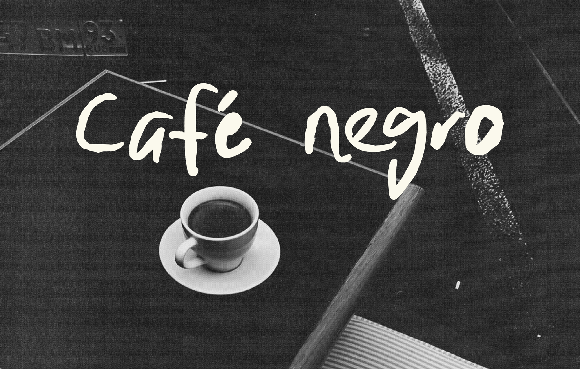
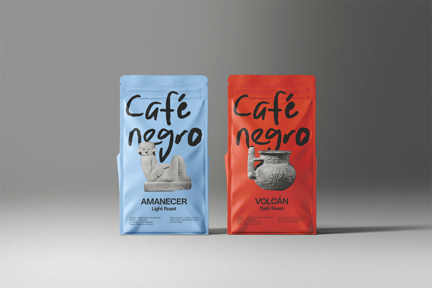
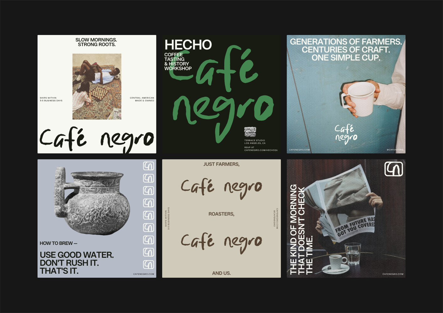
The final brand system brings together loose, hand-scrawled typography with Mayan artifacts, documentary-style photography, and a color palette pulled from Central American landscapes.
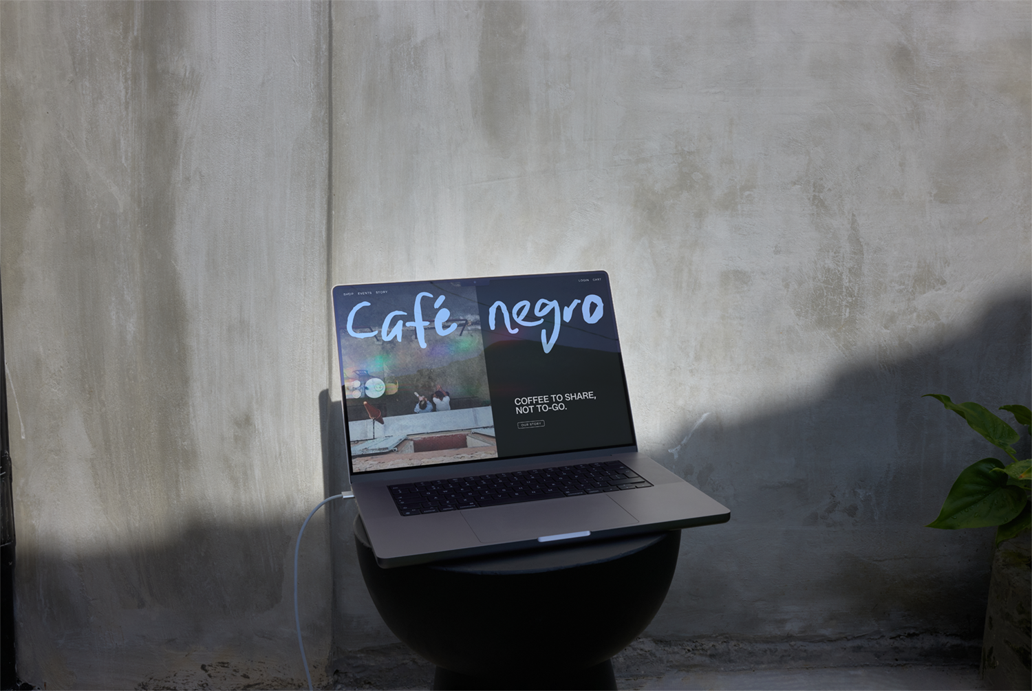
We created a flexible toolkit that works across packaging, social media, web, and physical spaces while maintaining the brand's raw voice.


The Outcome
The brand identity gives Café Negro a complete visual foundation that challenges industry norms while staying deeply rooted in Central American heritage. The system works hard without showing off, supporting the brand's mission to restore comfort to daily coffee. Overall, it gives the team clear direction to maintain consistency as they grow without losing the spirit that makes them different.
Credits
Typefaces — Resist Sans Display, Nadea, Abacaxi Latin Variable
Year
2025