


Website Design / UX Design
Super Mercado
Client
Super Mercado
Services
Website Design, UX Design, Information Architecture, Brand Expansion for Web
About the Project
Jeff Mercado is an Emmy award-winning producer and photographer whose work celebrates Latinx communities, sports culture, and overlooked voices. His existing portfolio wasn't reflecting the full scope of his creative services or attracting the collaborations he envisioned. We partnered with Jeff to redesign Super Mercado's digital presence, building a site that positions him as a multifaceted creative partner and director in the industry.

Our Approach
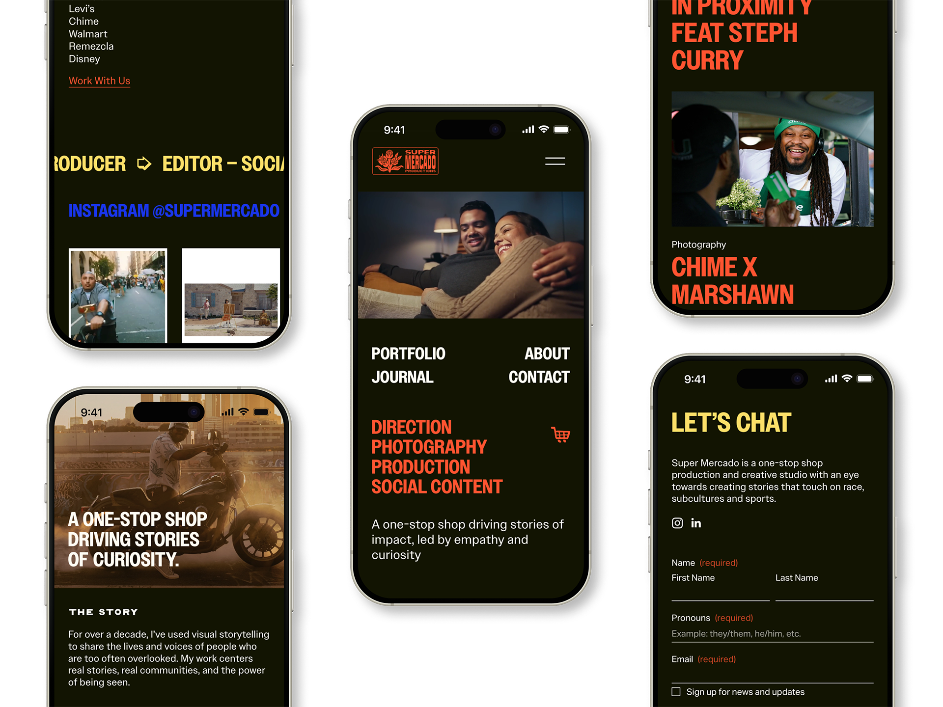
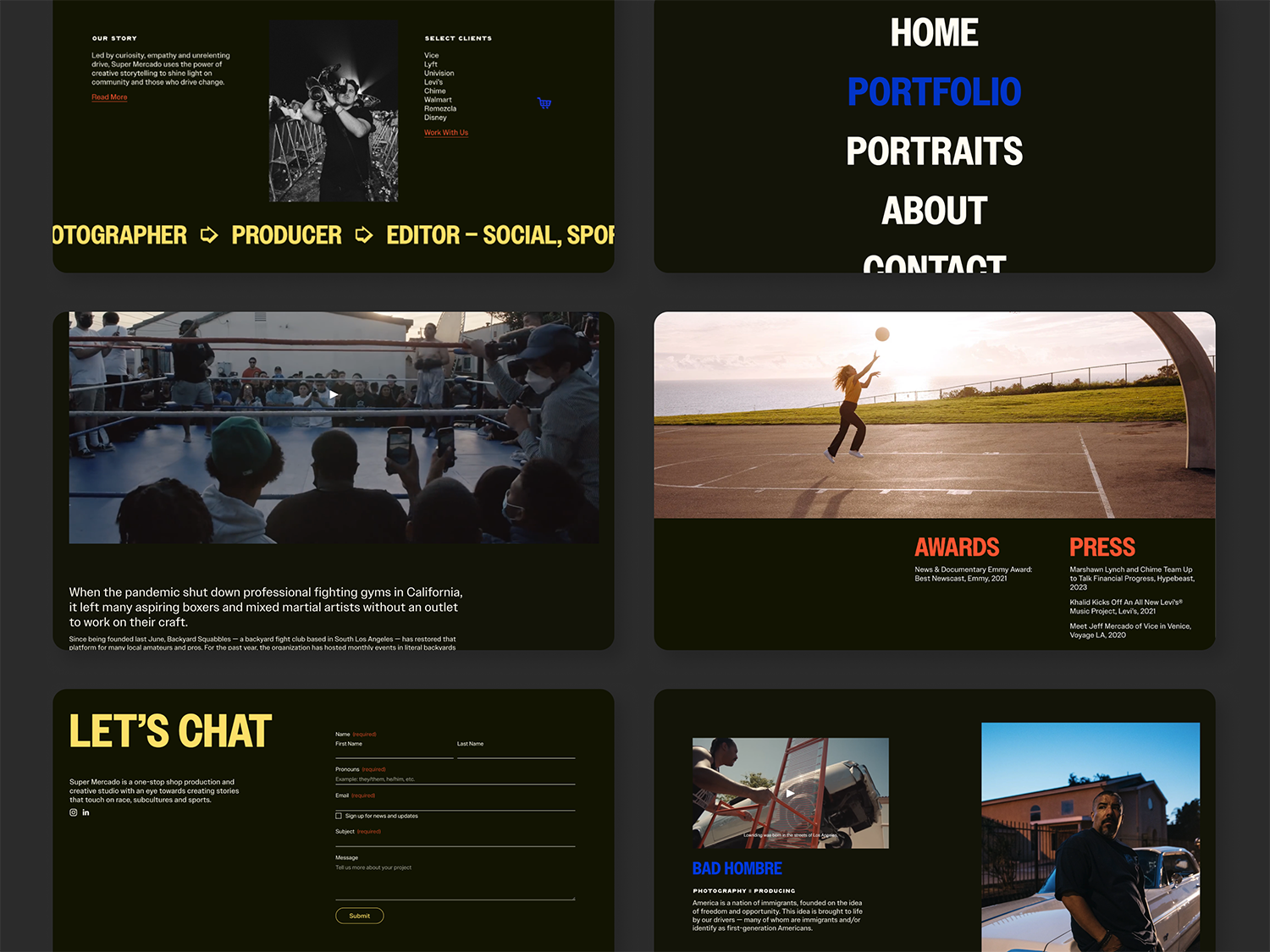
We started by simplifying the information architecture, addressing the navigation confusion that was creating barriers for potential clients from his previous website. We identified Jeff's desire to move beyond being pigeonholed as a photographer and instead showcase his capabilities across direction, production, and image-making. Our website strategy centered on translating the Latinx bodega-inspired brand identity into a lively, engaging digital experience that uses the visual language of his Latinx roots while emphasizing creative versatility.
The Solution
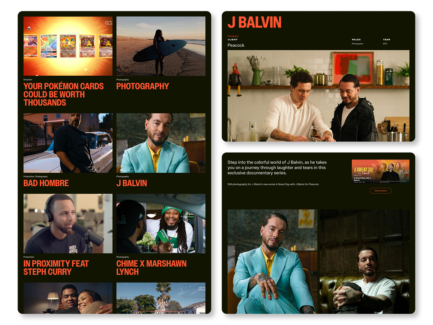
The redesigned site features a streamlined structure with an impactful homepage reel, curated portfolio highlighting 2-3 key projects, and clear pathways to collaboration. We expanded the typography palette and developed visual treatments that play with the logo suite's lighthearted energy while maintaining professional credibility.
The design prioritizes video and photography content over text-heavy pages, with integrated social feeds that keep the portfolio feeling current and connected to Jeff's creative work.
The Outcome
The new Super Mercado site positions Jeff as a full-service creative collaborator ready to work with brands at the intersection of sports and culture. By clarifying his offerings and simplifying how clients discover his work, the portfolio now supports his vision of building a production studio with impact-driven, high-caliber partnerships. The design gives him a platform that grows with his ambitions while staying true to the community-centered storytelling that defines his vision.
Credits
Typefaces — TAY Dreambot, Owners Narrow, Owners Text
Brand Identity
We Are Done